The quest for texture
I am trying to get more texture and some graphic abstraction into my paintings. There is so much one can do with interesting tools, and I have picked up techniques like image transfer, stencilling and lots more that I want to use with more confidence.
I choose a common subject for three different papers to see if any has decisive advantages. I love painting dryads - the modern version of people who are part tree, rather than the Greek myth murderous forest keepers - so I quickly find some references for faces and flowering trees, ending up with cherry and pear trees. I transfer them from my monitor, then draw more accurately. My papers are 30×40cm watercolour paper of my art supplier's own brand, 200g/cm²; A3 Bristol carton, 250g/cm²; and a new acquisition, A3 synthetic paper. I tape the papers to my painting board with gummed tape, wetting the Bristol one and leaving the watercolour paper as is; the synthetic paper promises to be entirely buckle-free. I work on all three simultaneously.
To avoid a fifteen-minute read, I will give each an own article over the next two days.
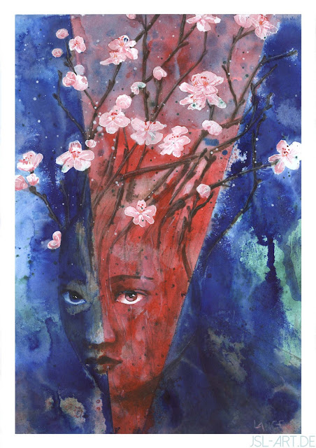
The Cherry Dryad (Texture Quest I)
I start with splashing acrylics onto the paper in carmine red and a mixture of greens, both with a touch of leftover paints that amount to a greenish grey. I have found it helps immensely in making the colours appear harmonious to add even the slightest amount of the same colour all around. I then mask of the eyes and blossoms and add salt to some wet areas. Acrylics are never really soaked up by the salt but instead make these little intense spots in bright areas.
I add cerulean blue for an impression of the sky, then work on the face and twigs with a warm mixture of ultramarine and raw umber. Normally, this gives a type of grey that can easily vary its temperature.
However, I find that this ruins things. It was supposed to be a colourful, summer image - now it's muddy and has too many colours. I tape off a triangle in the middle, cover the sides, and add crimson ink to the middle, then after it dries, tape off the sides and add cyan to them, with pipettes and lots water to make it float. I tip the board while it's wet to make drips.This was scary, but I really like the result; the grey now functions like an underpainting, there is more texture, and the colours are high in chroma, with some parts of the previous work showing through. Taking off the tape blemishes the paper and tears off some masking fluid that I re-apply between the stages. Small blemishes can often be painted over with acrylics. After rubbing off the masking tape, I paint the face and twigs with matching acrylic paint and diluted raw umber, sorting out any asymmetry; not a lot of work is needed on it. I draw the blossoms with white gel pen, and finally spatter some white paint over the upper area by tipping the brush against my other hand.
I scan it in three parts, make PS stitch them together, clean up the trim, and voilá.


Comments
Post a Comment