Posts

Showing posts with the label Walkthrough

The Pear Dryad (Texture Quest III)
Image
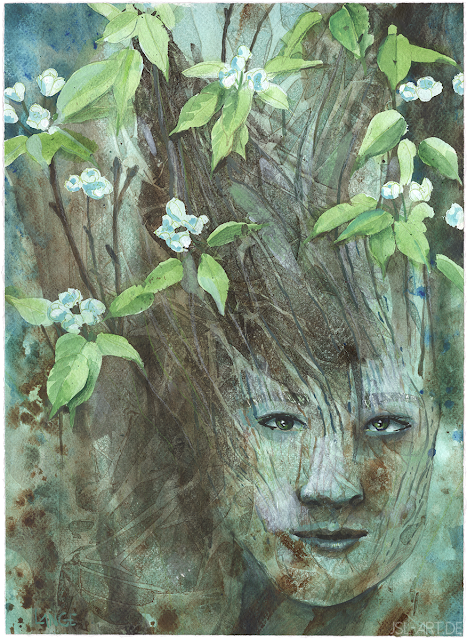
  After masking the blossoms, I start with a wash of green on the bottom that I flick pure water into for texture.      While adding cerulean blue to the cherry dryad, I do the same here and add burnt umber and ultramarine blue, dabbing one brush in all paints and making irregular strokes and spatters, adding many but harmonious colours. I like adding paint like this in early stages since it adds both pure colour and blended strokes. I keep the browns to the lower and blues to the upper and outer part.      Onto a thin wash of mostly raw and burnt umber, I add cling film from the kitchen to dry with texture, which creates a kind of branch-y texture I like a lot.  I do more layers with this technique. In the end I think I should've stopped before the last layer which is fairly dark, but you never know this going on so I let it sit.  I work on the face with mixtures of the previous colours, and start emphasising some twig structures and bark on...

The Oak Dryad (Texture Quest II)

Image
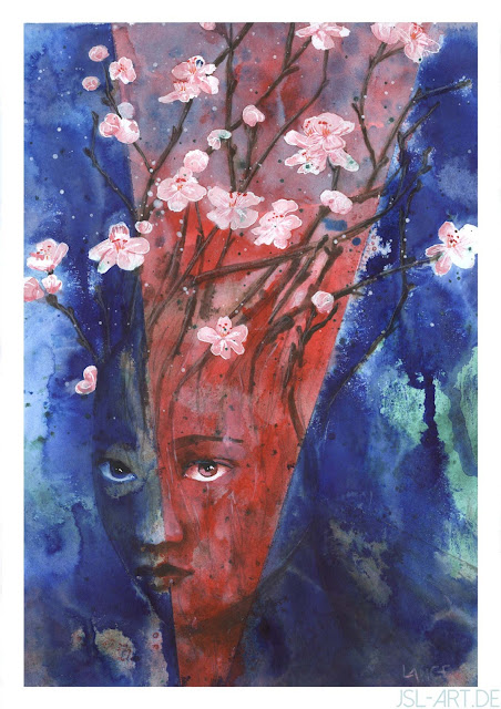
The synthetic paper is... weird. It's made for watercolours; it does feel like painting on plastic. It doesn't soak at all, and paint lifts off it easily. I start with some spattering effects with acrylics and inks, which become muddy soon. After trying to get some other texture effects going which fails, i turn to simpler drip effects, diluted an understated cool green and brush it onto the long side while tipping the board to make it flow. Interestingly, it runs along the coloured pencil lines I had drawn, which looks nice. I work all over the piece with brushstrokes, trying to get a feeling for how much water to add and how to blend strokes. I scratch out some lines to help with bark texture with scratching knives. It's only slowly moving into a direction I like; I use a compass for some circles and find the pencil scratches down to the surface, lifting paint off. I drip some more wet paint around the place and finally use the alleged strength of the synthetic, and rub d...

The quest for texture

Image
I am trying to get more texture and some graphic abstraction into my paintings. There is so much one can do with interesting tools, and I have picked up techniques like image transfer, stencilling and lots more that I want to use with more confidence. I choose a common subject for three different papers to see if any has decisive advantages. I love painting dryads - the modern version of people who are part tree, rather than the Greek myth murderous forest keepers - so I quickly find some references for faces and flowering trees, ending up with cherry and pear trees. I transfer them from my monitor, then draw more accurately. My papers are 30×40cm watercolour paper of my art supplier's own brand, 200g/cm²; A3 Bristol carton, 250g/cm²; and a new acquisition, A3 synthetic paper. I tape the papers to my painting board with gummed tape, wetting the Bristol one and leaving the watercolour paper as is; the synthetic paper promises to be entirely buckle-free. I work on all three simultane...

Sketchbook September 2017

Image
I paint my sketchbooks' boring grey covers before using them, and this is my current book started in September.

Genius Loci: Mindsmith - Progression

Image
A portrait of a Genius Loci character, or rather, profession: a mindsmith. I also created a GIF progression, so you can see how I made him (I believe it's a him - I'm honestly not sure, raganaj aren't dimorphous). You can find the article about these powerful psychologists in the Genius Loci blog, Starmaker's Gaze: http://starmakersgaze.blogspot.de/2016/12/mindsmiths.html

Rhoeneoak - Principium Streets

Image
An illustration for the Rhoenoek novel world of John Enitsu, with a GIF progression. http://www.Facebook.com/RhoenoakBookOfficial

Harpies: Keeper

Image
Early this year, harpies began crowding in my sketchbook, and have by now become a small world with a total of four harpy tribes in various degrees of human shape. These are the most human-like, without wings (I think) and only claws on their hands and scaly legs, but they rely heavily on magic to try and suppress the other three tribes. Right now there are some ink drawings, a charcoal face study and 3D model, this painting and lots of sketches, with another larger painting already on its way to the canvas (meaning, it's sketched and modelled, but I need to find the time).

Sketchbook Cover - May

Image
My standard sketchbooks are bound in grey carton that is great for working on. This is the A5 portrait format I use when going out. I digitally mock up the head-with-hands, and sketch it in charcoal on architect's vellum  - you can see the sketch at the top. After priming the sketchbook's cover with white acrylic paint I use a brown watercolour pencil for sketching, and then dab in first strokes of the colours I want. I have cheap acrylics left I use instead of my artist's grade paints, so I won't be sorry when it eventually gets beaten up from travelling. I work on the glass pane of an old picture frame, which is easy to clean, and I can put my sketches under it, like here: I'm going for garish colours, so I use the paints straight from the tube, expertly titled "brown" or "orange". Wonder why I want to get rid of them? I cover the entire thing in a thin wash of orange and apply reds and yellows with palette knives. Every now and then ...

Rhoenoak: Pat vs Maruga

Image
Another illustration for the scifi/fantasy novel world Rhoenoak I'm illustrating for the author. This the the main character Pat, a pyrokinetic, battling the shapeshifting evil maruga. I also made my first time-lapse GIF for it:

Making Of "The Tale of Nahil and Remor"

Image
There are some pieces of advice you will be told by everyone. The usual reason is, they really are true, and so important it can well stand some repetition. So, I'll repeat this: Never be afraid to use reference. And if something's wrong in your picture, fix it right away. It won't grow out, it won't go away, and no amount of beautiful rendering can make up for errors in anatomy, composition and perspective. See the fullsized tutorial on deviantArt:  http://ranarh.deviantart.com/art/Making-of-The-Tale-Nahil-and-Remor-495563668

Map creation V

Image
My map goes along for a while. Every now and then I add details; I place the capitals (various maps use stars, squares, circles, castles etc to indicate them. I use bordered circles by dotting them with a full-opacity brush and choosing Stroke in the Layer effects menu in Photoshop). I decide I want islands and soon despair because creating them with the lasso is tedious and provides ugly, repetetive results. I resolve the matter as follows (this should have been done much, much earlier, so make sure you do this step as one of the first): In a new file in Photoshop, I choose Render>Clouds, then Render>Difference Clouds several times. Then on a Levels adjustment layer I push the sliders until my "clouds" are only black and white (could also be done with a Posterize layer, set to 2 levels). Ta-dah, these will be my coastline and islands! I cut, paste, transform and rearrange to my heart's content, erasing the water (I still have a file with the water on a separ...

Wild river steps

Image
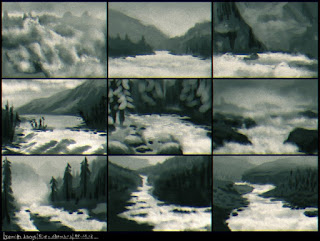
From a recent activity in an online drawing group, the assignment was to paint a downstream river where it becomes wild. 1 - I use basic brushes in Painter for thumbnails, drawing wild water within appealing landscapes. 2 - I expand the lower right sketch and rearrange the landscape with transform tools and overpainting in Photoshop. 3 - Using references for colours I start to paint over in Painter, paying particular attention to the atmospheric perspective. I make heavy use of papers for the textures, especially for the rocks.   4 - I keep refining the depth appearance throughout the picture and add much detail to the foreground, keeping the structures as diverse as I can. I create the village huts and cattle enlarged and shrink them into place. The river is done with basic and custom brushes and textures of coffee stains and clouds. 5 - I start the woods with tree brushes in Photoshop and overpaint them with scraggly brush movements. I add small details li...

Keep an eye out

Image
Bonus information for Tiny Tip #20 Download (ranarh.deviantart.com) My twentieth tutorial from the "Ranarh's tiny tips" series. You can find the other tutorials at my deviant Art account . - The lens sticks out of the eyeball. That's why it so often catches highlights - they do not necessarily appear inside the pupil. When painting mirrored reflections, keep in mind only lit parts are reflected. Reflections can make the pupil appear less than round from afar. - The eyeball is reddish at the inner corner. Some phenotypes have a yellowish eyeball, especially very dark black skinned people. - Eyelashes with heavy black makeup are easier to paint, but I urge you to learn to paint them without first. Lashes are about as long as the eyeball in profile - often men's are longer - and stick out in irregular rows. Don't zoom in too much, that minimizes the risk of too short lashes. Under harsh light, lashes cast a long shadow, especially at the outer corner. ...

"Leviathan": working steps

Image
Gigantic monsters aren't my usual, but the open mouth of a ship-eating leviathan popped into my head with chilling clarity. Or so I thought before I put the stylus to the tablet ;) I sketched some thumbnails in Painter to compare view points. As usual, I chose the composition of one and the lighting of another and went to work with colour.   For colour blocking, I use the largest brush possible and set it to colour jitter. I chose a colour scheme of almost complementary fleshy pink and sea blue, and fixed the position of some tentacles so that they are better balanced throughout the picture. I centralized the mouth and used several ragged brushes and spattery airbrushes in Painter. References were used for the ship and waves. I finally moved the thing into Photoshop, and used Images>Adjustments>Variations to further enhance the atmospheric effect.

Arborie: A walkthrough

Image
Arborie is a character I was commissioned to paint. Here are a few working steps. Thumbnails I scribble some rough poses for the client. We agree on a lying pose; the character is fashionable and confident, and a harper and swordfighter. The character is from a Dungeons&Dragons setting, but I decide to create my own take and not rely on the official artwork. Refined sketch and colours I create a refined sketch based on reference pictures - photos of myself for the character, various flowers, the harp (tricky perspective), and plenty more pictures for inspiration like for the sword hilt or jewelry. Via email, the client and I agree on warm autumn colours. I also want some interesting lighting and decide to create dappled light falling through the leaves overhead; this will require careful handling of the colour of lights and shadows because the light spots will be very bright and saturated, but the overall colours are supposed to be warm as well. I used Painter so far. ...