Posts

Showing posts from 2012

Wild river steps

Image
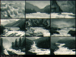
From a recent activity in an online drawing group, the assignment was to paint a downstream river where it becomes wild. 1 - I use basic brushes in Painter for thumbnails, drawing wild water within appealing landscapes. 2 - I expand the lower right sketch and rearrange the landscape with transform tools and overpainting in Photoshop. 3 - Using references for colours I start to paint over in Painter, paying particular attention to the atmospheric perspective. I make heavy use of papers for the textures, especially for the rocks.   4 - I keep refining the depth appearance throughout the picture and add much detail to the foreground, keeping the structures as diverse as I can. I create the village huts and cattle enlarged and shrink them into place. The river is done with basic and custom brushes and textures of coffee stains and clouds. 5 - I start the woods with tree brushes in Photoshop and overpaint them with scraggly brush movements. I add small details like d

Interview on Squidoo

My art recently caught the attention of friendly writer Adrien Scott:, who just did an interview with me for Squidoo. We talk about inspiration, motivation, and advice with a feature of some of my artworks. You can read it here: http://www.squidoo.com/art-features-jennifer-s-lange

Brush and Nebulae packages

Image
I created these two resource packages, "11 patterned pen brushes for Corel Painter", and "5 stellar nebulae backgrounds". You can download them on my deviantArt account ranarh.deviantart.com , both are licensed under the Creative Commons Attribution-Noncommercial License, so you can use them anywhere you don't make money with. Have fun with them!

Patterns, papers, and brushes in Painter

Image
To make certain that a pattern has correct perspective, you will have to paint it by hand. But here are some techniques to make your life easier if perspective doesn't matter so much. Using Brushes as patterns I arrange the brush settings like this: I then use the Pinch and Bulge brushes from F-X carefully to match the perspective. Advantages: by adjusting the spacing or colours (or Color Variability > From Gradient) you can make many different versions of the pattern. You can use any brush type you are comfortable with. Using patterns as... well, patterns You can capture anything as a pattern in the Pattern Panel. Patterns can be used with the Fill Bucket , Pattern Pens , and as Clone Source , making them quite versatile. Capture patterns intended for lace and such as masked patterns to preserve transparency. Painter handles making seamless tiles nicely under check out pattern . Advantages: the Fill Bucket's great for fabric patterns or buildings.

Keep an eye out

Image
Bonus information for Tiny Tip #20 Download (ranarh.deviantart.com) My twentieth tutorial from the "Ranarh's tiny tips" series. You can find the other tutorials at my deviant Art account . - The lens sticks out of the eyeball. That's why it so often catches highlights - they do not necessarily appear inside the pupil. When painting mirrored reflections, keep in mind only lit parts are reflected. Reflections can make the pupil appear less than round from afar. - The eyeball is reddish at the inner corner. Some phenotypes have a yellowish eyeball, especially very dark black skinned people. - Eyelashes with heavy black makeup are easier to paint, but I urge you to learn to paint them without first. Lashes are about as long as the eyeball in profile - often men's are longer - and stick out in irregular rows. Don't zoom in too much, that minimizes the risk of too short lashes. Under harsh light, lashes cast a long shadow, especially at the outer corner.

"Leviathan": working steps

Image
Gigantic monsters aren't my usual, but the open mouth of a ship-eating leviathan popped into my head with chilling clarity. Or so I thought before I put the stylus to the tablet ;) I sketched some thumbnails in Painter to compare view points. As usual, I chose the composition of one and the lighting of another and went to work with colour.   For colour blocking, I use the largest brush possible and set it to colour jitter. I chose a colour scheme of almost complementary fleshy pink and sea blue, and fixed the position of some tentacles so that they are better balanced throughout the picture. I centralized the mouth and used several ragged brushes and spattery airbrushes in Painter. References were used for the ship and waves. I finally moved the thing into Photoshop, and used Images>Adjustments>Variations to further enhance the atmospheric effect.

Arborie: A walkthrough

Image
Arborie is a character I was commissioned to paint. Here are a few working steps. Thumbnails I scribble some rough poses for the client. We agree on a lying pose; the character is fashionable and confident, and a harper and swordfighter. The character is from a Dungeons&Dragons setting, but I decide to create my own take and not rely on the official artwork. Refined sketch and colours I create a refined sketch based on reference pictures - photos of myself for the character, various flowers, the harp (tricky perspective), and plenty more pictures for inspiration like for the sword hilt or jewelry. Via email, the client and I agree on warm autumn colours. I also want some interesting lighting and decide to create dappled light falling through the leaves overhead; this will require careful handling of the colour of lights and shadows because the light spots will be very bright and saturated, but the overall colours are supposed to be warm as well. I used Painter so far.

Spacesuits

Image
Some designs for spacesuits for an rpg campaign we are playing. We have this very old but perky ship, and of course wear boardsuits so that we don't all die when there's a hull breach. The GM liked the spacesuit I designed for the spacepilot from my recent blog entry, but I came up with some more advanced-looking, skintight designs anyway. Simple grayscale sketches over silhouettes. I really like working symmetrically, it saves a lot of time ;)

Character designs

Image
 Some recent character designs I did for a group I run of deviantArt. I was surprised that people apparently liked the tiny back story to this piece: The neighbourhood witch is the creepy old lady living at the end of the road. Nobody ever sees her do the groceries or mow her lawn, and there are plenty of balls in her front yard because nobody dares get them back. And maybe there really is something true about the rumours that every time someone gets lost or a murder is committed, she has a new cat afterwards...

Portrait with reptiles

Image
I started this early in January when I fiddled with Painter 12's mirror feature to create a portrait and then added some fractals and lizards for interest. There are about five hours of work in this; I meant it to be only a speedpainting but now find that I may have taken it a little beyond that.

Map Creation IV

Image
I decide against my sloppy handwritten names and get a nice free font from dafont.com to type everything (of course handwritten text is much nicer, but takes a lot more time). I use no more than three font sizes and rotate the names when needed, but keep them straight; curved text will be reserved for landmarks. If a name really doesn't fit, I put it outside, either overlapping the border when there is a lot of room, or connect the name and land with a line. This requires a little shuffling to make sure everything is readable. I now have three maps on poster format. The prices for having these printed are murder, so I divide them into nine pieces each, add the topology as grayscale, print them at home and tape them together, then hang them up the wall. From now on every time I pass my maps, I will add a little something; a mountain here, a capital there. I have often found that taking my time will give better results, and I expect this step of naming everything to take just u

Light tutorial

The Light tutorial series by Richard Yot has proven invaluable to me. Richard explains natural light and artificial light, lighting conditions and how they can be used to effect in art. He clears up thinking mistakes in stereotypical lighting, and uses wonderful pictures for examples. Everything is easy to understand. I strongly suggest to read this tutorial, and then go paint som wonderful light!

Mountains and lakes

Image
Speedpainting based on an Al.chemy scribble. I played a bit with the channels after flipping through Exodyssey by Steambot Studios, and I like some of the effects that it produced. Also, handpaint is better for birds; I often use custom brushes, but they need tweaking anyway, so I guess I can just scribble them myself from the start...

Map Creation III

Image
Now for some colours. Right now I want a topological map showing the heights of the land. Green is for sealevel heights; the colours go from brighter green to yellows, ochre, browns, and the highest mountains will become grey, then white. This is standard, anyway; you might want to try other colours. I keep the outlines on a separate layer set to Multiply and lay down flat colours. I keep the landmass as a selection made from the outside of the linework, and the water on top. I roughly blend the colours with low-opacity brushstrokes, and then put several textures (rust-stained paper, acrylics paint strokes) over them to provide details. I use them on low opacity as Overlay and Soft Light layers. After that, on a new layer I brush in shadows on the lower right sides of the mountains, and use some of the texture details to put in even more mountains. I fix up the rivers with the lasso tool and add some more. I could of course texture the water as well but find it too distracting for no

Starmaker's Gaze blog

I created a new blog for my fantasy setting Genius Loci at starmakersgaze.blogspot.com Along the paintings, you can find a lot of descriptions there (its not just a visual development, there is actually quite a lot of writing involved in coming up with a world) and, hopefully soon, some of the sketches I do. this blog right here will of course stay online. The fact remains that I wouldn't know where else to put spaceships.

Steampunk mechanic concept

Image
Originally done as an assignment for a group I run on deviantArt. 1. Sketch I quickly scribble some sketches to get the steampunk stuff down. I already know I want an older guy with the classical hat of an engine-driver, and come up with a pressured strength-enhancing arm, jumping boots, the inevitable goggles, and a lot of tools, including a pocket watch. I sketch in Painter 12 with the Real 6B Pencil on an A4-sized canvas. I usually use a different color than grey to sketch for a more lively effect. 2. Clean drawing I use Poser Pro to set up a view of the character and indicate lighting (which I will later ignore, but it inspires me for the right lighting conditions) and export the render as a png. I make a cleaner drawing over it, again in Painter. 3. Colour flats For the first colour blocking, I often use Painter, because the colour wheel beats Photoshops colour picker hands down. But here, I use a technique I learned from the youtube videos from Feng Zhu Design Sch

Brilliant Al.chemy

Image
I've recently discovered the sketching software Al.chemy for myself. Sometimes I paint on the base of a collage of plenty of gradients, structures, and textures, then draw a sketch on top and develop a painting from it, but Al.chemy can do all that in a much more random way, plus nice recording functions. Here are some of the sketches I created with Al.chemy; the cityscape has had a little touch-up in Photoshop. Al.chemy is an open source software and it's free to use. You can download it on http://al.chemy.org/

Genius Loci races: Garren

Image
The lizard people of Kitas are called garren, or singular gar. Don't be irritated by the race template, they normally wear clothes. Their long tail is flexible, if clumsy, and can be used as a weapon, mostly they drag it on the ground. Smaller body parts like the tail or fingers can be grown back, although it takes several months. Garren can have practically any colour and pattern; they can change it by eating certain foods, and after a little while they change in appearance. The patterns are never quite certain. The crest is covered in soft thin scales and flexible between stabilizing spikes. Garren have quick reflexes and lots of stamina; since they are also cold-blooded, they prefer the southern region and are most common in northern Lozir, but can be found anywhere. Psychologically, garren are impulsive and usually the first to act. They tend towards polarized views; because of the trouble the combination can get them in garren are often found in voice houses getting counsel b

Genius Loci races and cultures

I think of Genius Loci as a world of its own and not a sibling to earth - different but the same - an especially not in any medieval terms, like cold dark castles, muddy streets, and dirty people, but not in unproblematic high fantasy terms either. The peoples of the setting are the classical races - there are humans and elves, dwarves and lizard people -  but I also invented some races that have not appeared elsewhere, and the "classics" are a little different, as are the relations between them. I am often bored with stereotypes and try to avoid them in my own creations. For example, elves and dwarves are not at odds, but in fact friendly towards each other since both are long-lived; elves are not superior. There are other creatures that take the place of the traditionally mysterious elves; the elves themselves are very down-to-earth, because I am bored with the overly powerful, overly magical, overly beautiful guys you meet in every fantasy forest. Many of the creatures wi

Map Creation II

Image
I scan the maps in two pieces each and puzzle them together in Photoshop. Taking a moment to set the scanner up correctly will save you a lot of work later; I only need to regulate the contrast a little and have nice outlines. Still, I go over every line zoomed in closely to fix up all errors, like smudges and grey areas. For a first printable version, I put all maps on the same format, add a border and name - and look, a previously mediocre scribble looks totally professional all of a sudden ;) If you are happy with the map like this, think about using different font-styles for the features, like italic for mountains. Let the names follow the direction of the map feature, but don't put them in too wildly or the map will be hard to read.