Posts

Keep an eye out

Image
Bonus information for Tiny Tip #20 Download (ranarh.deviantart.com) My twentieth tutorial from the "Ranarh's tiny tips" series. You can find the other tutorials at my deviant Art account . - The lens sticks out of the eyeball. That's why it so often catches highlights - they do not necessarily appear inside the pupil. When painting mirrored reflections, keep in mind only lit parts are reflected. Reflections can make the pupil appear less than round from afar. - The eyeball is reddish at the inner corner. Some phenotypes have a yellowish eyeball, especially very dark black skinned people. - Eyelashes with heavy black makeup are easier to paint, but I urge you to learn to paint them without first. Lashes are about as long as the eyeball in profile - often men's are longer - and stick out in irregular rows. Don't zoom in too much, that minimizes the risk of too short lashes. Under harsh light, lashes cast a long shadow, especially at the outer corner. ...

"Leviathan": working steps

Image
Gigantic monsters aren't my usual, but the open mouth of a ship-eating leviathan popped into my head with chilling clarity. Or so I thought before I put the stylus to the tablet ;) I sketched some thumbnails in Painter to compare view points. As usual, I chose the composition of one and the lighting of another and went to work with colour.   For colour blocking, I use the largest brush possible and set it to colour jitter. I chose a colour scheme of almost complementary fleshy pink and sea blue, and fixed the position of some tentacles so that they are better balanced throughout the picture. I centralized the mouth and used several ragged brushes and spattery airbrushes in Painter. References were used for the ship and waves. I finally moved the thing into Photoshop, and used Images>Adjustments>Variations to further enhance the atmospheric effect.

Arborie: A walkthrough

Image
Arborie is a character I was commissioned to paint. Here are a few working steps. Thumbnails I scribble some rough poses for the client. We agree on a lying pose; the character is fashionable and confident, and a harper and swordfighter. The character is from a Dungeons&Dragons setting, but I decide to create my own take and not rely on the official artwork. Refined sketch and colours I create a refined sketch based on reference pictures - photos of myself for the character, various flowers, the harp (tricky perspective), and plenty more pictures for inspiration like for the sword hilt or jewelry. Via email, the client and I agree on warm autumn colours. I also want some interesting lighting and decide to create dappled light falling through the leaves overhead; this will require careful handling of the colour of lights and shadows because the light spots will be very bright and saturated, but the overall colours are supposed to be warm as well. I used Painter so far. ...

Spacesuits

Image
Some designs for spacesuits for an rpg campaign we are playing. We have this very old but perky ship, and of course wear boardsuits so that we don't all die when there's a hull breach. The GM liked the spacesuit I designed for the spacepilot from my recent blog entry, but I came up with some more advanced-looking, skintight designs anyway. Simple grayscale sketches over silhouettes. I really like working symmetrically, it saves a lot of time ;)

Character designs

Image
 Some recent character designs I did for a group I run of deviantArt. I was surprised that people apparently liked the tiny back story to this piece: The neighbourhood witch is the creepy old lady living at the end of the road. Nobody ever sees her do the groceries or mow her lawn, and there are plenty of balls in her front yard because nobody dares get them back. And maybe there really is something true about the rumours that every time someone gets lost or a murder is committed, she has a new cat afterwards...

Portrait with reptiles

Image
I started this early in January when I fiddled with Painter 12's mirror feature to create a portrait and then added some fractals and lizards for interest. There are about five hours of work in this; I meant it to be only a speedpainting but now find that I may have taken it a little beyond that.

Map Creation IV

Image
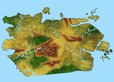
I decide against my sloppy handwritten names and get a nice free font from dafont.com to type everything (of course handwritten text is much nicer, but takes a lot more time). I use no more than three font sizes and rotate the names when needed, but keep them straight; curved text will be reserved for landmarks. If a name really doesn't fit, I put it outside, either overlapping the border when there is a lot of room, or connect the name and land with a line. This requires a little shuffling to make sure everything is readable. I now have three maps on poster format. The prices for having these printed are murder, so I divide them into nine pieces each, add the topology as grayscale, print them at home and tape them together, then hang them up the wall. From now on every time I pass my maps, I will add a little something; a mountain here, a capital there. I have often found that taking my time will give better results, and I expect this step of naming everything to take just u...