Map Creation IV
I decide against my sloppy handwritten names and get a nice free font from dafont.com to type everything (of course handwritten text is much nicer, but takes a lot more time). I use no more than three font sizes and rotate the names when needed, but keep them straight; curved text will be reserved for landmarks. If a name really doesn't fit, I put it outside, either overlapping the border when there is a lot of room, or connect the name and land with a line. This requires a little shuffling to make sure everything is readable.
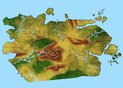
I now have three maps on poster format. The prices for having these printed are murder, so I divide them into nine pieces each, add the topology as grayscale, print them at home and tape them together, then hang them up the wall. From now on every time I pass my maps, I will add a little something; a mountain here, a capital there. I have often found that taking my time will give better results, and I expect this step of naming everything to take just under forever.

I now have three maps on poster format. The prices for having these printed are murder, so I divide them into nine pieces each, add the topology as grayscale, print them at home and tape them together, then hang them up the wall. From now on every time I pass my maps, I will add a little something; a mountain here, a capital there. I have often found that taking my time will give better results, and I expect this step of naming everything to take just under forever.


Comments
Post a Comment